
SOAP Identity
Almost nobody outside the immediate team knew what SOAP stood for. Every deck, spec, and Figma file used whatever labeling felt right that day, so reviews kept opening with the same question: whose is this? Nobody asked me to fix it. I just got tired of watching it happen.
Approach
Self-initiatedI wasn't assigned this. I sketched a first version on my own time, then pitched it back to the team, not as a mandate, but as an option. From there the process became the deliverable: a few honest directions, shown early, refined by reactions from PM, Engineering, and Data. Partners weren't just reacting to a logo, they were deciding what they wanted this thing to stand for.
Logo
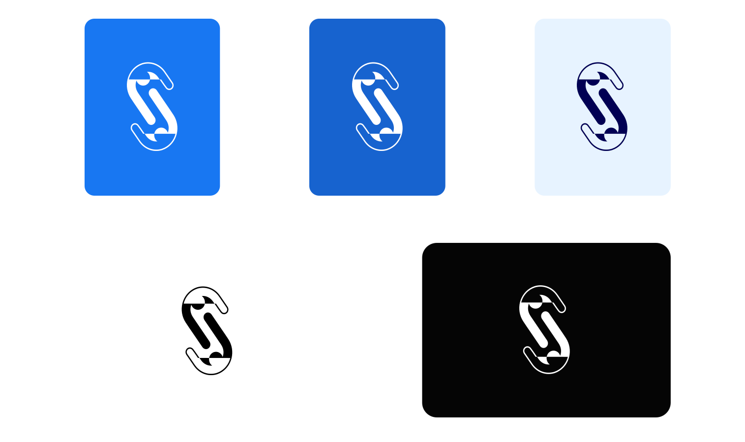
The mark is a monogram built from the "SOAP" name, drawn to hold its shape whether it's sitting on brand blue or standing alone on white or black.
Design system
A one-mark identity only earns its keep if it holds up everywhere it lands, so I documented the essentials: the palette, and how the mark behaves on the surfaces it would actually live on.
Color palette
Usage
Outcomes
Shipping a shared identity removed friction that had been invisible until it wasn't. All active SOAP Figma files adopted it within two months, and Engineering, Data, and PM partners started using it in their own decks without being asked. It even became the team's workplace avatar.
That's the part I'm proudest of, not that people adopted it, but that they kept using it long after I'd moved to a different team and had nothing left to gain from it.