Visibility
Maximize social proof visibility so friends' presence was unmissable.

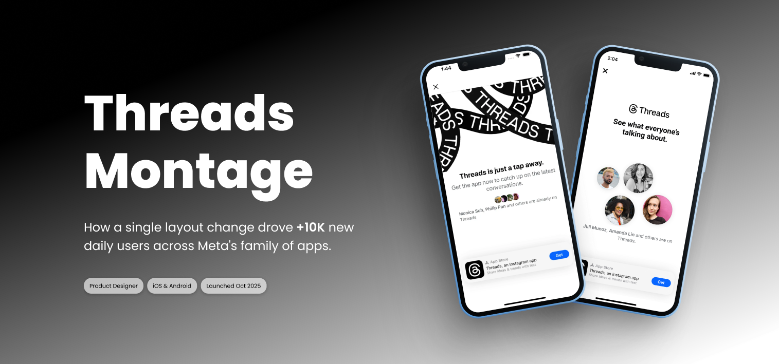
When Threads content appears inside Facebook, the "tap to install" moment is everything. People are curious enough to click, but not yet sold on downloading. That put a lot of pressure on the post-tap install screen. In just a few seconds, it needed to answer "what is this?" and "is it worth downloading?" while the person was still in the moment.
This was part of a broader push to improve conversion on Facebook's Threads entrypoints, specifically by making the install experience feel clearer and more personally relevant.
The existing UI showed small, generic profile pictures with limited visual hierarchy. Users scrolled past these screens without absorbing the social proof message, missing a critical motivator for joining a new platform.
How might we redesign the Facebook-to-Threads conversion experience to better leverage social proof and drive more users to onboard?
My goal was to make the concept feel more obvious and personal by using the information people already recognize: familiar faces, recognizable names, and evidence that their friends were already there.
Maximize social proof visibility so friends' presence was unmissable.
Increase the visual weight of profile pictures for stronger recognition.
Show more friends while maintaining clarity and information density.
Deliver a consistent experience across iOS and Android platforms.
We tested multiple variants (including "learning" variants that isolated single changes, and "launch candidate" variants that combined changes). The reason I appreciated this approach is it prevented us from over-attributing results to a "bundle" without knowing what actually helped.
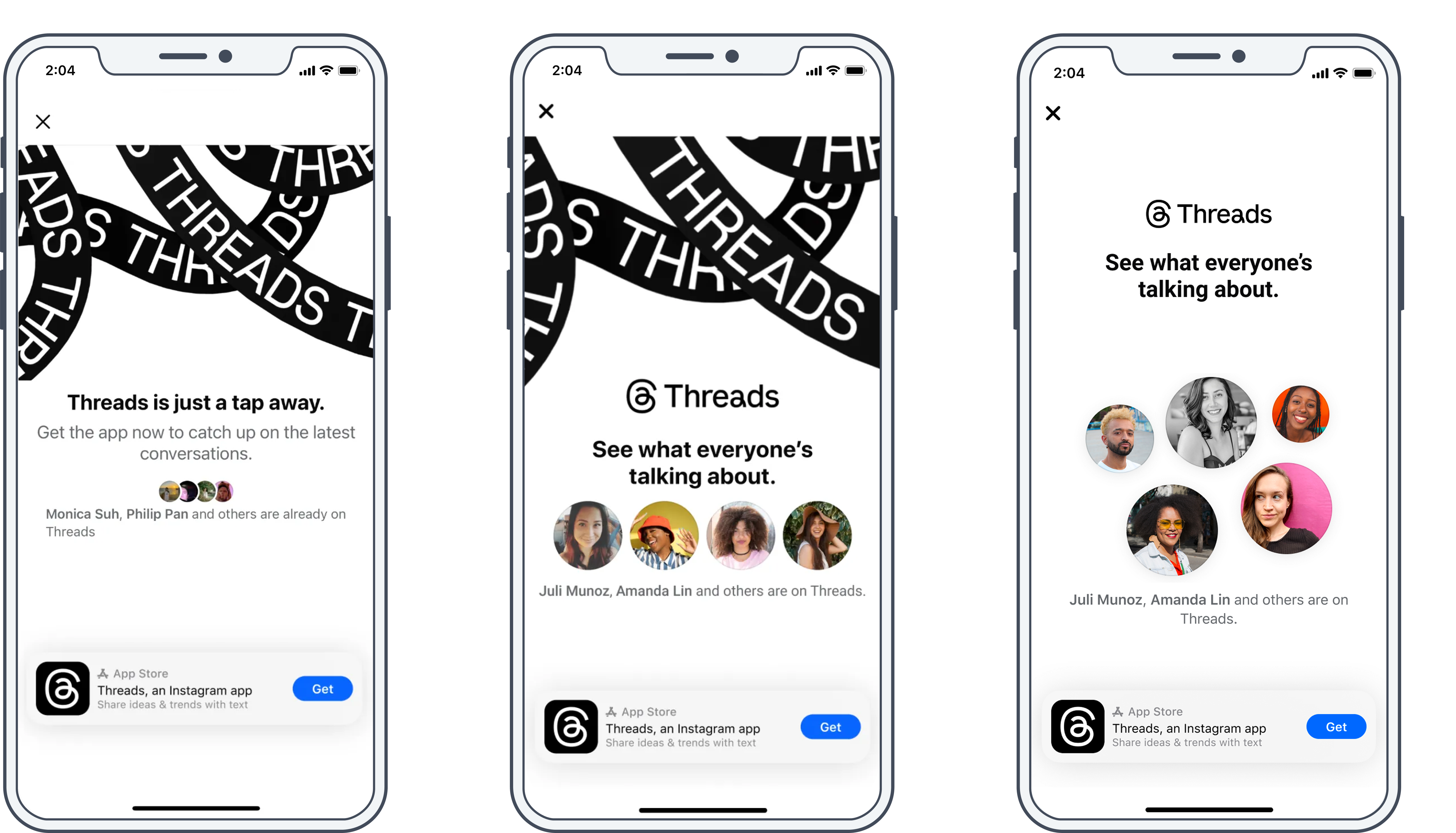
The approved final treatment centered the social proof message more clearly. We reduced competing visual information and made the friends' presence easier to understand at a glance.

The Montage layout earned that result by making social proof impossible to miss. Giving familiar faces more visual weight meant the screen could answer the key question faster: are the people I care about already here?
The Montage design pattern also influenced the broader Threads growth strategy, becoming a foundational element for social proof experiences across Meta's family of apps.
People trust people. The design challenge isn't convincing users to join. It's showing them that people they already trust are already there.
Clarity beats cleverness. Simpler screens converted better and felt more trustworthy.
Experiments need to be legible, not just different. The best variants weren't just visually distinct. They were designed to actually answer a question.
The Montage design pattern also influenced the broader Threads growth strategy, becoming a foundational element for social proof experiences across Meta's family of apps.
Facebook leads had a legitimate concern: the Montage design leaned on Threads' visual language, and on a Facebook surface, that felt like letting another brand take over. Inside Meta, each app guards its surface carefully. It took multiple rounds and a formal reviews before it moved forward.
I understood the concern, but the person seeing this screen wasn't thinking about brand boundaries, they were seeing their friends. I'd also been working closely with Instagram designers on a similar pattern, and their early results were strong. It stopped being a debate about taste and became a conversation about evidence.