CONTEXT
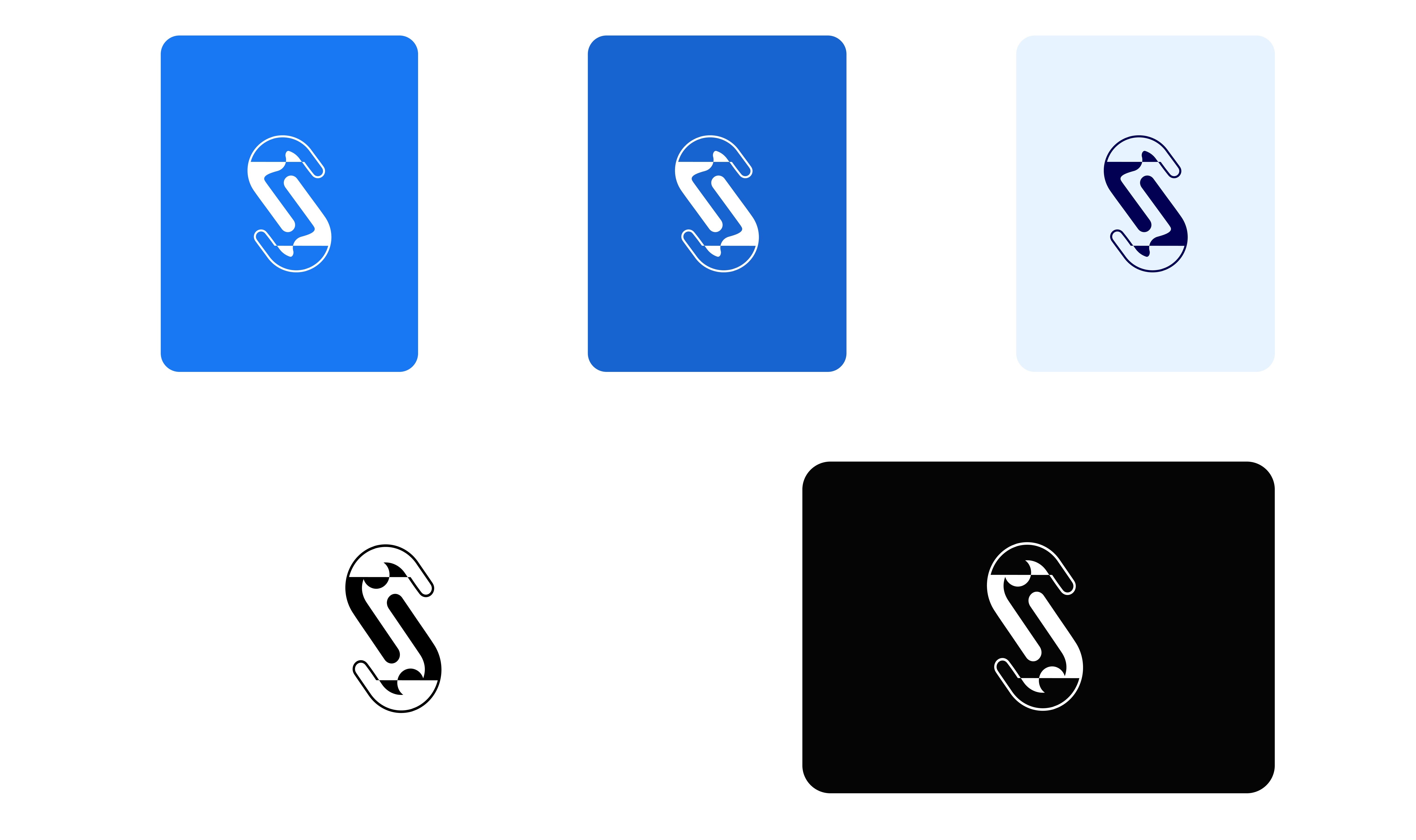
SOAP lacked any internal brand identity. Decks, specs, and Figma files used ad-hoc labeling, making cross-functional communication harder. A lightweight logo system would anchor the project visually without competing with the consumer product.
LOGO
SWAG
OUTCOMES
Shipping a shared Identity for SOAP removed friction that had been invisible until it wasn't. Before the system, every cross-functional review started the same way: someone asking which project this was, which team owned it, what SOAP stood for. After rollout, that overhead disappeared.
All active SOAP Figma files adopted the system within two months. Engineering, Data, and PM partners began using the lockup in their own decks without being asked. The icon became the additional-profiles workplace avatar, a small signal that the identity had stuck beyond the design team.